Take a Sad Plot & Make It Better
June 15, 2019
Date
September 26, 2019
Time
6:15 PM – 8:15 PM
Location
Nous House, Melbourne, Australia
Event
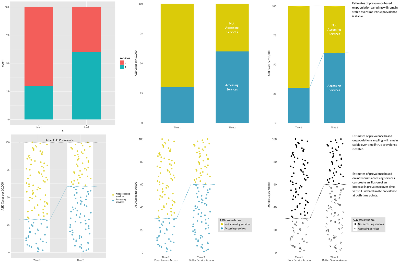
In this talk, Alison will talk about one plot’s life cycle, from a sad Powerpoint slide to an Excel chart and finally to the finished product made with the ggplot2 package in R. Along the way, she will discuss why each version of the plot fails in different ways and how each iteration improved on the last one.

Latest event
This talk was most recently given at the University of South Wales on 2019/10/04.